Privacy Center Widget Configuration
A step-by-step guide to configuring the Privacy Center widget for use on your website.
Overview
To configure or update the Privacy Center widget, click on Privacy → User Experiences → Privacy Center to configure the widget.
Note: If you have multiple regions setup, select the region you want to configure from the Region drop-down selector in the top left of the page above the Privacy Center title.
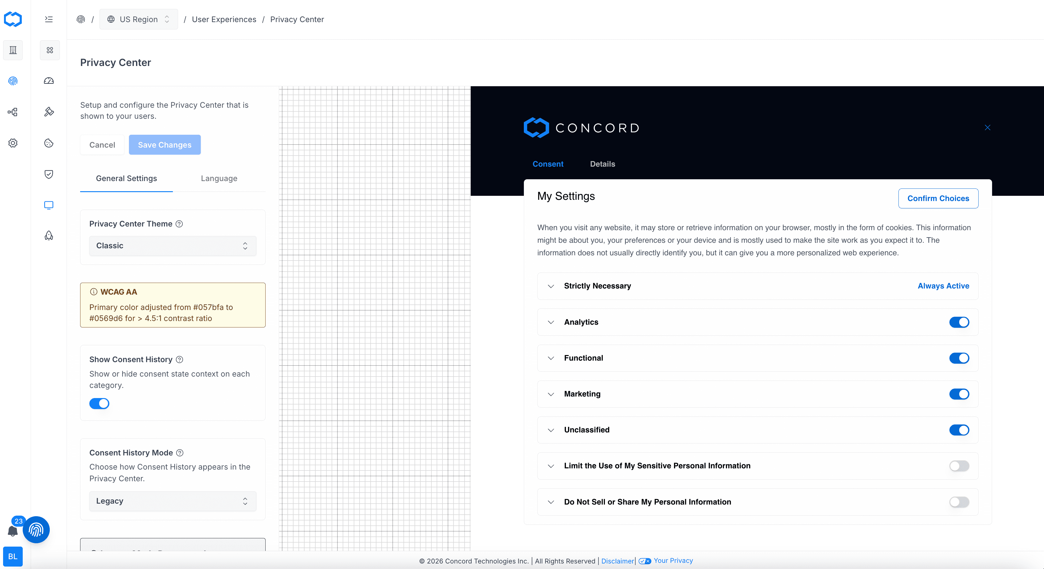
Privacy Center: General Settings
In the Privacy Center → General Setting tab, you can setup and configure the Privacy Center that is shown to your users. In this section you can configure the following:
- Privacy Center Themes: The theme of the Privacy Center on your website. Can be set to classic, light, dark, or brand. All themes use your primary color for most of your custom branding (buttons, links, etc.). For the background, brand will use your secondary color, dark uses a very dark gray. light uses white, and classic uses a white background with a header in your secondary color.
- WCAG AA: WCAG AA is the internationally recognized standard for web accessibility, ensuring digital content is usable by people with disabilities. Contrast is adjusted to a minimum 4.5:1 ratio for text to background, ensuring readability for visually impaired users.
- Show Consent History: When enabled, each consent category displays its current state (e.g. Accepted, Declined, Implied) along with the date the choice was last made.
- Consent History Mode: Options include legacy, standard, or both. Legacy shows the full Consent History panel. Standard shows status labels on each consent category. Both enables both experiences.
- Legacy Mode Deprecated: Use Standard mode for the new simplified consent history treatment. Legacy mode will be removed soon.
- Show All Vendors Section: Displays a combined list of all vendors across all consent categories. This is in addition to per-category vendor details shown when categories are enabled, and is recommended in all modes.
- Show Disclosures Section: Whether or not the Privacy Disclosures panel is shown to your users in your Privacy Center. When enabled, the panel surfaces the Policy Links configured under Policies → Links — privacy policy, terms of service, cookie policy, data protection agreement, and any custom policies.
Privacy Center: Language
In the Privacy → Privacy Center → Language tab, you can setup and customize the verbiage displayed in your Consent Banner. Concord provides suggested text however, we also offer extensive customization options so you can change text to align with your business needs and language style. You can customized the following text in your company’s Consent Banner:
- Consent Settings
- Consent Settings Title: The text used for the Consent Settings title.
- Consent Setting Text: The text used for the Consent Settings description.
- Confirm Button: The text used for the Consent Settings button.
- Consent Categories
- Strictly Necessary Title: The text user for the Strictly Necessary title.
- Strictly Necessary Text: The description user for the Strictly Necessary section.
- Analytics Title: The text user for the Analytics title.
- Analytics Text: The description user for the Analytics section.
- Functional Title: The text user for the Functional title.
- Functional Text: The description user for the Functional section.
- Marketing Title: The text user for the Marketing title.
- Marketing Text: The description user for the Marketing section.
- Unclassified Title: The text user for the Unclassified title.
- Unclassified Text: The description user for the Unclassified section.
- Privacy Disclosures
- Privacy Disclosures Title: The text used for the title of the Privacy Disclosures panel in your Privacy Center.
- Privacy Disclosures Description: The text used for the description of the Privacy Disclosures panel in your Privacy Center.
- Vendors
- Vendors Title: The heading displayed above the All Vendors section in your Privacy Center.
- Vendors Description: The description shown in the All Vendors section of your Privacy Center.
- Vendors Link Title: The text of the link button in the All Vendors section of your Privacy Center.
- Privacy Requests
- Privacy Requests Title: The text used as a title for the Privacy Requests panel.
- Privacy Options Title: The text used as a title for the Privacy Options section.
- Privacy Options Description: The text used as a title for the Privacy Options description.
- Options Button Text: The text of the button to show Privacy Request options.
- Change Request Title: The text of the button for requesting changes to a user’s data.
- Change Request Description: The text describing data change requests.
- Delete Request Title: The text of the button for requesting deletion of a user’s data.
- Delete Request Description: The text describing data deletion requests.
- View Request Title: The text of the button for requesting a copy of a user’s data.
- View Request Description: The text describing user data copy requests.
- Do Not Sell Request Title: The text used for the title of the Do Not Sell or Share Request form in the Privacy Center widget.
- Do Not Sell Request Description: The text used for the description of the Do Not Sell or Share Request form.
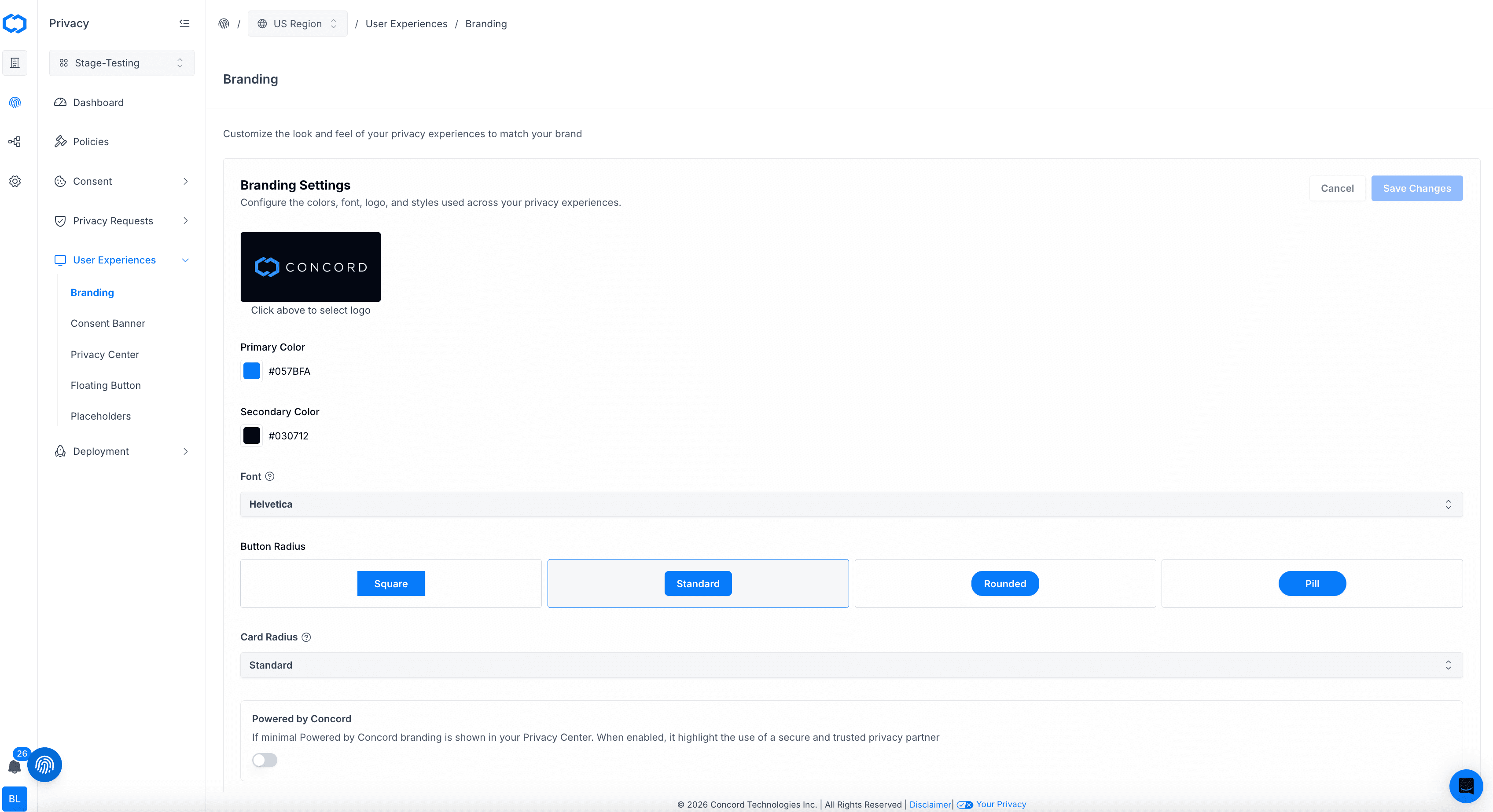
Privacy Center: Branding - Setting Your Company Logo, Colors & Branding
You can also configure the branding of the Privacy Center Widget by navigating to Privacy → User Experiences → Branding. Your secondary color is used for the header color of the Privacy Center and the primary color is used throughout the Privacy Center for items like buttons, links, and hover colors. You can customize the following to align with your brand:
- Logo
- Logo file size is limited 512KB.
- Logos are restricted to .png formats.
- There are no height or width restrictions, but logos are resized in the widget to a max-height of 40px so 40px is the preferred height.
- Primary and Secondary Color
- Primary color is used for the buttons and links in your Consent Banner.
- Secondary color is used for the background of the header in your Privacy Center.
- You can either choose a preexisting color by clicking on any of the default colors shown or you can input a Hexadecimal color value (for example: “#22194D”). HSB and RGB color codes are also accepted.
- If you do not know the proper Hexadecimal color value for your desired branding, you may search online for “hexadecimal color picker” to find free tools for choosing a color and finding its hexadecimal value.
- Font: Choose a font that represents your brand identity. The selected font will be applied to all text elements in your privacy experiences.
- Button Radius: Choose how your buttons display in the Privacy Center (square, standard, round, pill).
- Card Radius: Choose the radius of the cards in your user experiences.
- Powered by Concord: Branding (this is only customizable on Pro and Premium plans)
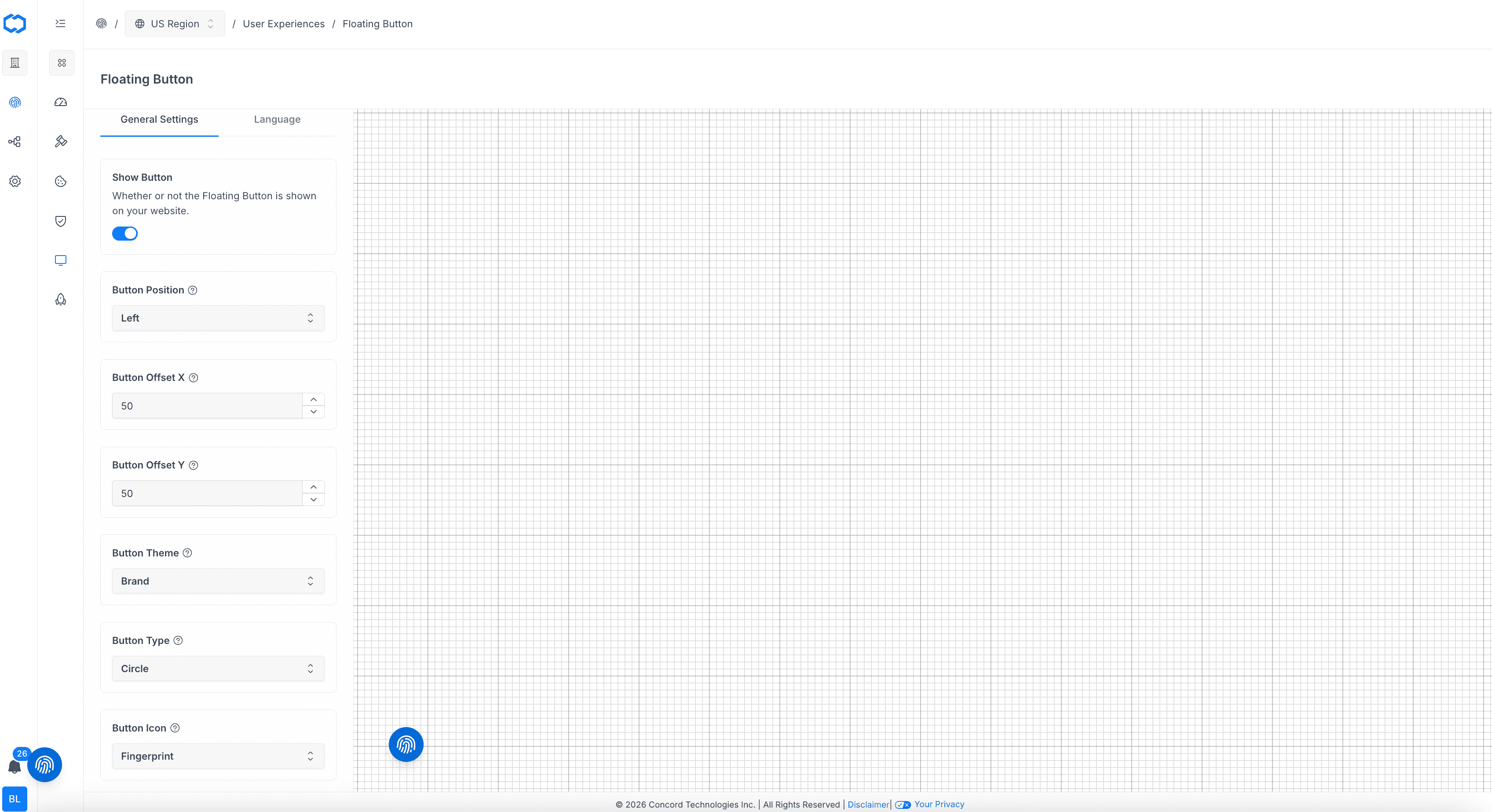
Privacy Center: Floating Button
You can also configure the branding of the Privacy Center Widget by navigating to Privacy → User Experiences → Floating Button. In this section you can setup and configure the Floating Button that enables your users to easily access your Privacy Center. On the General Settings tab, you can customized the following Floating Button features:
-
Show Button: Turn the floating button on or off.
-
Button Position: The position of the Floating Button on your website. Can be placed on the right or left of the screen and will be 24px from the bottom and 24px from the side.
-
Button Offset X: The horizontal offset of the Floating Button on your website.
-
Button Theme: The theme of the Floating Button on your website. Can be set to brand, light, or dark. Brand will use your primary color as the background. Light uses white.
-
Button Type: The type of Floating Button you want to use on your website. Options are a tab with text or a circle with an icon.
-
Button Icon: The icon used for the Floating Button on your website. You can choose between a fingerprint, a cookie, or a shield.
-
On the Language Settings tab, you can customize the following Floating Button features:
- Tab Text: The tab text used for the Floating Button on your website.
Privacy Center Direct Access Links
Configuring Direct Access Links to Your Privacy Center.
Setting Up Custom Branding (Logo, Colors, Font & Button/Card Radius)
How to update the logo colors, font, and button/card radius within Concord for use in your unified Privacy Center and Consent Banner website experiences.