Product News: Consent Banner Policy Link Tokens & Custom CSS Overrides
Two upgrades for the consent banner, privacy center, and floating button — reusable Policy Link tokens inside banner text, plus a full custom CSS surface for advanced customization.
Concord Team · Published Sun Apr 26 2026

Our latest release provides improved workflows and advanced options for how you configure and brand your privacy and consent experiences: Policy Link tokens for consent banner text, and a full custom CSS layer — CSS variables plus raw CSS — for the consent banner, privacy center, and floating button.
Both changes orient around the same idea. The built-in controls are are best for most companies and are built around providing beautifully designed compliant experiences, but when you need to go further, you should have an easier way to do so without relying upon more advanced options like our custom script functionality.
Policy Link Tokens in Consent Banner Text
Our new Policy Link Tokens feature makes it easy to add or adjust the links that are used in your consent banner (Privacy Policies, Cookie Policies, Terms of Service, etc.), while still maintaining and leveraging shared configuration settings for those policies.
How it works
Policies → Links is the new home for reusable policy references. Each Policy Link has a Name, Description, URL, and one of five standard Policy Types — Privacy Policy, Terms of Service, Cookie Policy, Data Protection Agreement, or Custom for anything else (acceptable use, AI policies, and so on).
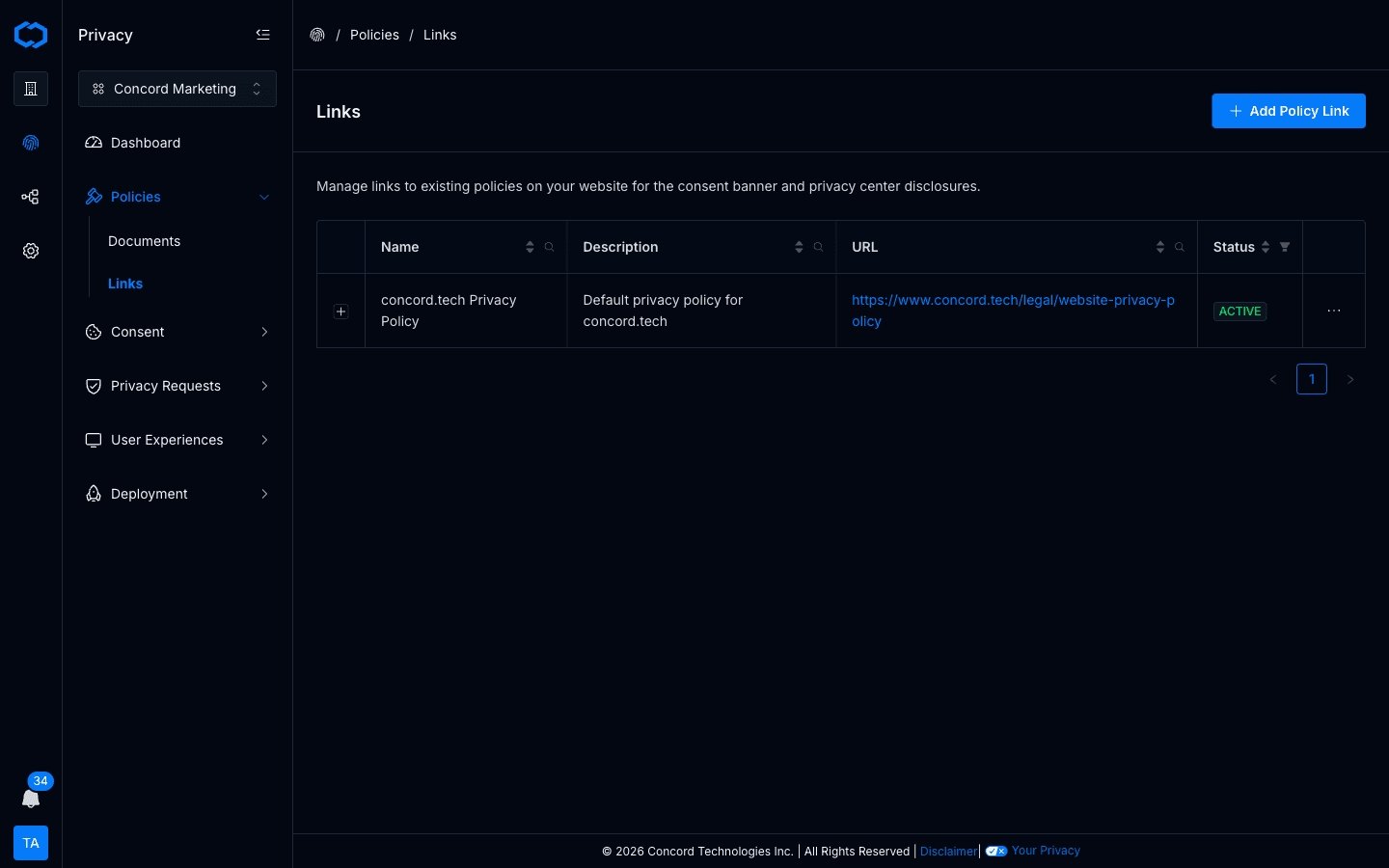
Once a Policy Link exists, the consent banner text editor exposes it through an Insert Link menu. Place the cursor where the link should appear, pick the Policy Link, and it renders as an inline token inside the banner copy. Override the displayed text per banner or per language if needed; the URL stays shared.
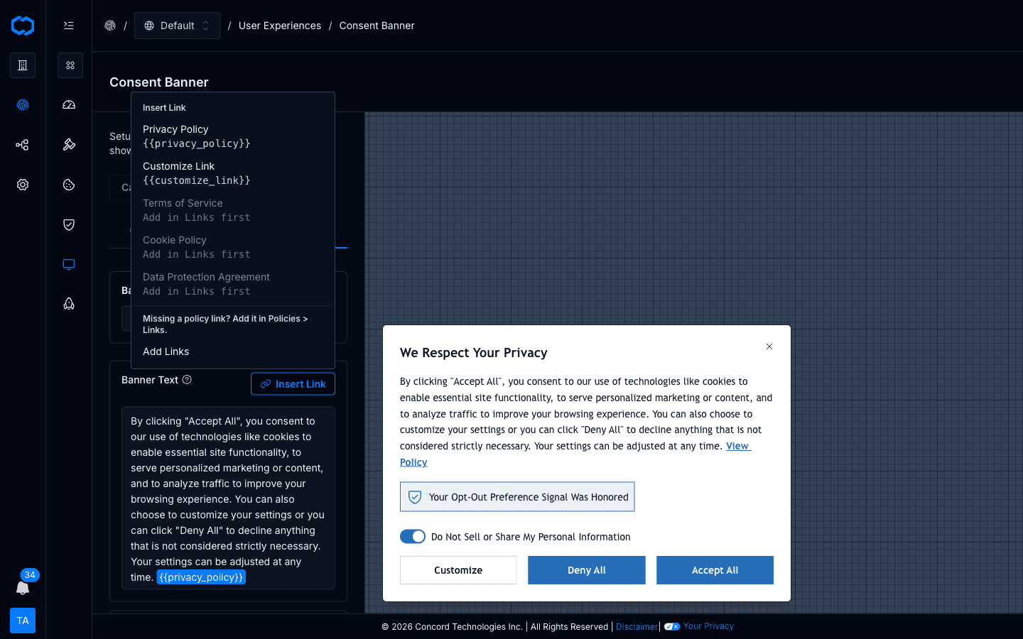
The same Policy Links are available inside privacy center disclosures, so the banner and the privacy center can reference the same underlying policy without drift.
Why it matters
- One URL, everywhere. Update the destination under Policies → Links and every region in a project that embeds that token picks up the change.
- Multiple policies per banner. Easily reference multiple policies in the same banner text, without copying URLs around.
- Region-aware without surgery. Each region's banner can embed a different subset of Policy Links, while the policies themselves remain defined once per project.
Legacy banners keep working. When you open a banner that was configured before tokens existed, Concord converts the old Policy + Link Text fields into a supported inline token automatically.
Full walkthrough: Managing Policy Links and the updated Configuring the Consent Banner.
Custom CSS for the Consent Banner, Privacy Center, and Floating Button
The built-in branding controls — theme, primary and secondary colors, typography, layout — cover what most companies need. They also ship with real guardrails: Accept and Deny keep balanced visual weight (treating them asymmetrically is a documented dark pattern under GDPR and CCPA/CPRA enforcement guidance), text-to-background contrast stays at or above 4.5:1 for WCAG AA conformance, and every interactive state — hover, focus, active, disabled — is designed for you across links, buttons, form controls, and focus rings.
For the subset of teams that need tighter brand fit than the built-ins allow, we've added two override layers.
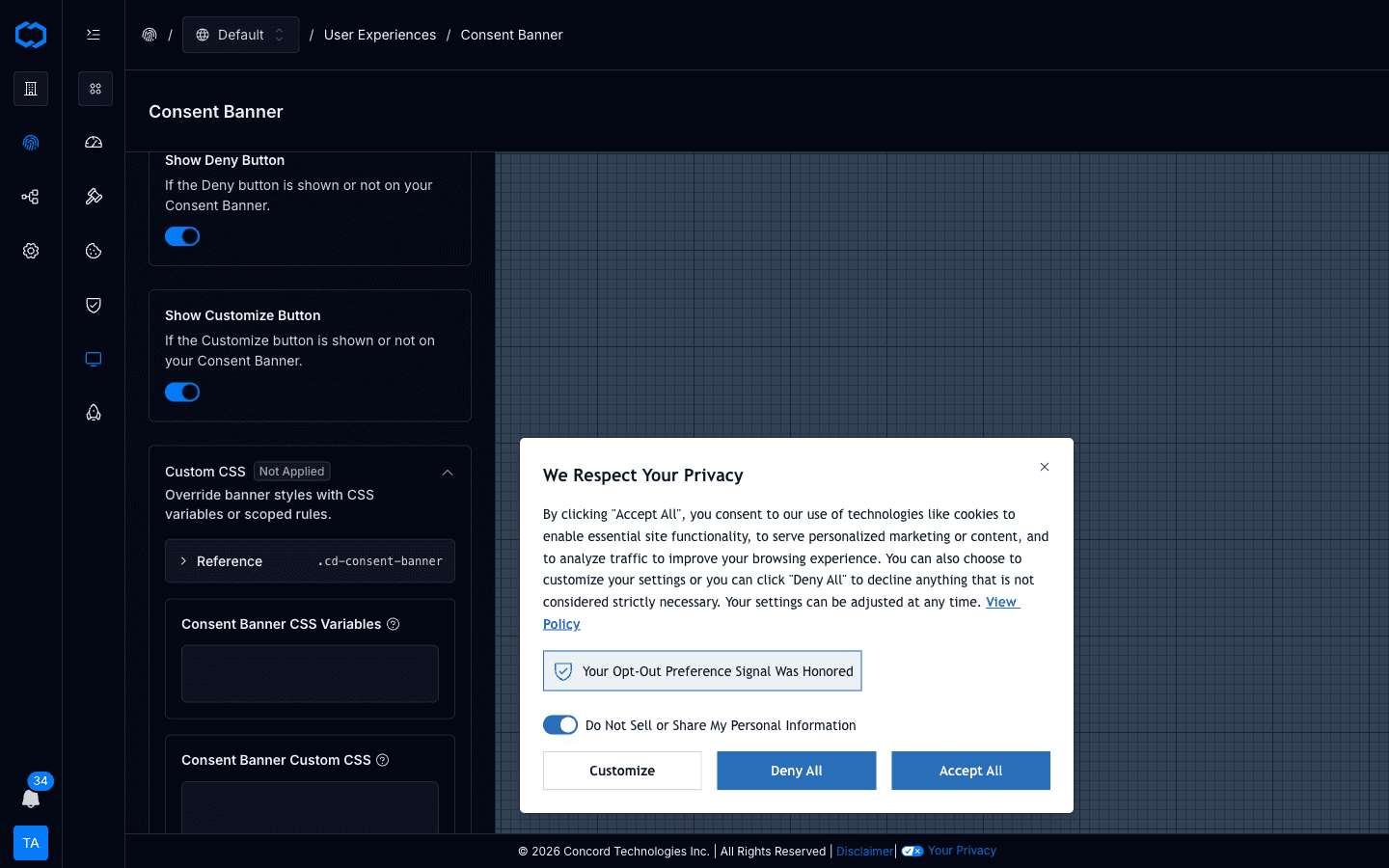
CSS Variables — the --cd-* token surface
A canonical set of design tokens is now exposed directly:
--cd-color-*— primary, foreground, hover, background, link, focus ring, plus widget-specific tokens like--cd-color-cb-accept-buttonand--cd-color-pc-button--cd-radius-*— button and card corner radii--cd-font,--cd-font-scale— font family and a unitless scale multiplier for proportional typography changes--cd-offset-*— vertical and horizontal offsets for the banner and floating button
Each widget editor includes a Reference card listing the tokens that apply to that widget. Override a token in the CSS Variables textarea and it takes effect immediately in the preview and, on save, publicly.
Custom CSS — scoped raw CSS
When a token doesn't cover the rule you need, the Custom CSS textarea accepts arbitrary CSS. Scope every rule with the widget's root class — .cd-consent-banner, .cd-privacy-center, or .cd-floating-button — so a rule meant for the privacy center doesn't match the floating button.
Widgets render inside a shadow DOM, so your page CSS doesn't leak in and widget CSS doesn't leak out.
Composition order
Concord composes the widget stylesheet server-side in this order:
- Base widget stylesheet
- Generated branding and theme CSS from the built-in controls
- Your
customCssVariables - Your
customCss
Your overrides win. That includes the accessibility and dark-pattern guardrails that the built-in controls enforce. Once you override a token or write raw CSS, staying WCAG AA and keeping Accept/Deny at comparable visual weight is on you — the composition applies whatever you specify. For most teams, the built-in controls are the right stopping point. The override layers are there for the teams that have a designer on the project and want to own the visual QA.
Availability
CSS Variables and Custom CSS are included on Pro, Premium, and Enterprise plans. Organizations on lower plans can still see the Custom CSS controls in each widget editor, but the inputs are disabled and saved overrides don't render publicly until you upgrade. Built-in branding controls remain available on every paid plan.
Full reference: Customizing Consent Banner Styling.
Getting Started
Both features are live in Concord today.
- Policy Link tokens — open Policies → Links in the admin, add your Privacy Policy, Terms of Service, and any other reusable links, then insert them into your banner text via the Language tab. Existing banners keep working; the next time you edit one, legacy links convert automatically where possible.
- Custom CSS — open any of Consent Banner, Privacy Center, or Floating Button under Privacy → User Experiences. The Custom CSS accordion is pinned to the bottom of each settings tab, with a Reference card listing the tokens that apply to that widget.
If you want a deeper walkthrough or have specific brand requirements the built-in controls don't cover, reach out to us. We're happy to help you scope the right layer for your setup.