Customizing Consent Banner Styling
Fit the Concord consent banner, privacy center, and floating button to your brand with built-in branding controls, CSS variable overrides, and full custom CSS.
Overview
Concord gives you three layers of customization for the consent banner, privacy center, and floating button, in order of how much responsibility you take on:
- Built-in branding controls — theme, primary/secondary colors, typography, and layout options exposed in the admin UI. These ship with accessibility checks and professionally designed states (hover, focus, disabled, active) and keep your experience on the right side of regulatory expectations around dark patterns.
- CSS Variables — override individual
--cd-*design tokens (colors, radii, offsets, font scale) when you need to go beyond the built-in controls. - Custom CSS — write scoped CSS rules for selector-level changes that tokens don't cover.
Use the layers in order. Most companies get what they need from layer 1 alone. Layers 2 and 3 are available on Pro, Premium, and Enterprise plans and are intended for teams that need tighter brand fit and are willing to own the visual QA themselves.
Customization and Compliance
Concord's built-in branding controls are designed so that whatever you pick, the result stays compliant and accessible:
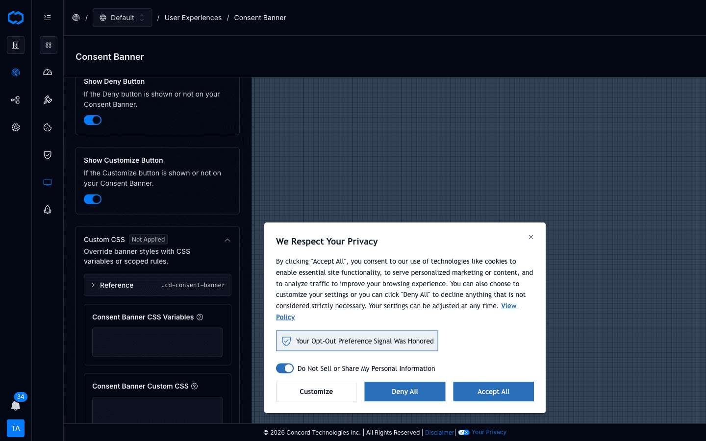
- Accept, Deny, and Customize buttons maintain balanced visual weight. Treating Accept differently from Deny (bright color for Accept, grayed-out for Deny) is a documented dark pattern under GDPR and CCPA/CPRA enforcement guidance. The built-in controls don't let you create that imbalance by accident.
- Contrast ratios designed and adjusted as needed to meet WCAG AA. Text-to-background contrast is targeted to stay at or above 4.5:1. The built-in WCAG AA checks and adjustments help enforce this automatically.
- Hover, focus, active, and disabled states are designed for you. Links, buttons, form controls, and focus rings all get consistent interactive states that work across themes, without you having to design each one.
When you step past the built-in controls into CSS Variables or Custom CSS, those guardrails are yours to maintain. Concord applies your overrides last in the cascade, so the final rendering reflects exactly what you specified, including styling that may not meet accessibility standards or that creates a dark-pattern imbalance between Accept and Deny. If compliance and accessibility matter for your deployment (and for most Concord customers, they do and should), the built-in branding controls are the right starting point and usually the right stopping point as well.
Availability
CSS Variables and Custom CSS are included on Pro, Premium, and Enterprise plans. If your organization is on a lower plan, the Custom CSS section appears in the banner, privacy center, and floating button editors but is disabled, and saved overrides don't render publicly until you upgrade. Built-in branding controls are available on every paid plan.
Where to Configure Styling
Each widget has its own editor in the admin:
- Privacy → User Experiences → Consent Banner
- Privacy → User Experiences → Privacy Center
- Privacy → User Experiences → Floating Button
Each editor surfaces a Custom CSS accordion pinned to the bottom of its settings tab. Inside the accordion you'll find:
- A Reference card with the canonical scope selector (for example
.cd-consent-banner) and the CSS variables that apply to that widget. - A CSS Variables textarea for
--cd-*declarations. - A Custom CSS textarea for scoped CSS rules.
How Overrides Are Applied
Concord composes the widget stylesheet in this order:
- Base widget stylesheet.
- Generated branding and theme CSS (from the built-in controls).
- Your
customCssVariables. - Your
customCss.
Raw CSS wins over token declarations when both target the same final property. Because the widget renders inside a shadow DOM, page-level CSS doesn't leak into the widget and widget CSS doesn't leak into your site.
Scope Selectors
Each widget renders with one of these classes on its root element — you don't add them yourself:
.cd-consent-banner.cd-privacy-center.cd-floating-button
In the CSS Variables textarea, declarations are wrapped automatically in the correct scope. In the Custom CSS textarea, prefix your selectors with the matching .cd-* class so a rule meant for the privacy center doesn't accidentally match the consent banner or floating button.
Token Reference (Common)
These are the tokens you'll reach for most often. The full list is shown in the Reference card inside each widget's Custom CSS panel.
Shared
| Token | Purpose |
|---|---|
--cd-color-primary | Main action color |
--cd-color-primary-foreground | Text/icon color on primary actions |
--cd-color-primary-hover | Hover state for primary actions |
--cd-color-secondary | Secondary / brand background color |
--cd-color-background | Base background |
--cd-color-foreground | Base text color |
--cd-color-link | Link color |
--cd-color-ring | Focus ring color |
--cd-font | Widget font family |
--cd-font-scale | Unitless multiplier that scales every text size proportionally. Default 1. |
--cd-radius-button | Button corner radius |
--cd-radius-card | Card corner radius |
Consent Banner
| Token | Purpose |
|---|---|
--cd-color-cb-accept-button | Accept button background |
--cd-color-cb-accept-button-foreground | Accept button text |
--cd-color-cb-deny-button | Deny button background |
--cd-color-cb-deny-button-foreground | Deny button text |
--cd-color-cb-customize-button-border | Customize button border |
--cd-color-cb-link | Inline link color inside the banner |
--cd-offset-cb-y | Distance (px) from the anchored vertical edge |
--cd-offset-cb-x | Distance (px) from the anchored horizontal edge (box layouts only) |
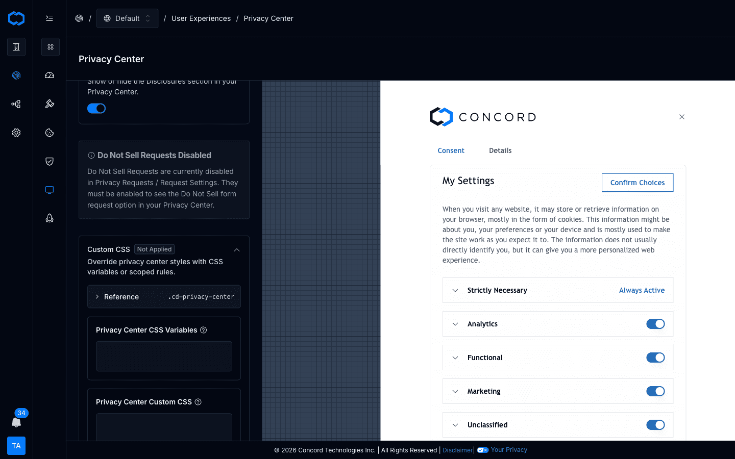
Privacy Center
| Token | Purpose |
|---|---|
--cd-color-pc-button | Primary button background |
--cd-color-pc-button-foreground | Primary button text |
--cd-color-pc-button-outline-border | Secondary button border |
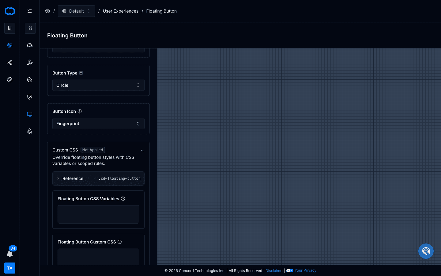
Floating Button
| Token | Purpose |
|---|---|
--cd-color-fb-background | Floating button background |
--cd-color-fb-foreground | Floating button text/icon |
--cd-offset-fb-circle-x | Horizontal offset for the circle floating button |
--cd-offset-fb-circle-y | Vertical offset for the circle floating button |
Examples
Brand Color Swap
Paste into the CSS Variables box of any widget:
--cd-color-primary: #0f766e;
--cd-color-primary-foreground: #ffffff;
--cd-color-primary-hover: #115e59;
Consent Banner — Brand Fit Without Breaking Accept/Deny Parity
--cd-color-cb-accept-button: #0f766e;
--cd-color-cb-accept-button-foreground: #ffffff;
--cd-color-cb-deny-button: #e5e7eb;
--cd-color-cb-deny-button-foreground: #111827;
--cd-color-cb-link: #0f766e;
--cd-radius-button: 9999px;
Keep Accept and Deny at comparable visual weight — both are real choices and regulators treat them that way.
Typography
--cd-font: 'Inter', system-ui, sans-serif;
--cd-font-scale: 1.0625;
Floating Button Shadow (Raw CSS)
Paste into the Floating Button's Custom CSS box:
.cd-floating-button {
  box-shadow: 0 12px 32px rgba(3, 7, 18, 0.24);
}
Lift the Banner Above a Sticky Mobile Footer
Paste into the Consent Banner's Custom CSS box:
@media (max-width: 639px) {
  .cd-consent-banner {
    --cd-offset-cb-y: 72px;
  }
}
Troubleshooting
My Changes Don't Appear
- Confirm your plan includes widget custom styling (Pro and above).
- Check for typos in the
--cd-*token name. - Confirm Custom CSS rules use one of the documented
.cd-*selectors.
Raw CSS Is Being Overridden by Something Else
Raw CSS is applied after token overrides, but if another .cd-* rule targets the same property with higher specificity, increase your selector's specificity rather than using page-level CSS.
I Already Use Legacy Variables Like --primary, --cb-*, or --pc-*
Legacy variables are still supported via aliasing. New overrides should prefer the --cd-* tokens, but existing configurations don't need to be rewritten immediately.
Related Documentation
Consent Reports & Metrics
The Consent Reports section in Concord is where you can find reporting on consent metrics and user preferences.
Configuring IAB TCF v2.3
How to enable and configure IAB Transparency and Consent Framework (TCF) v2.3 in Concord for GDPR-compliant advertising consent, including vendor management, stacks, legitimate interest, and privacy center integration.